Responsive Images Using Markdown in Scrivener
One of the main reasons to use [Markdown][#markdown] is to avoid any issues of layout, visual composition or rendering until after the actual content has been written. Unfortunately, when publishing something for the web, issues such as how content will display on different categories of devices do eventually need to be thought about. Image syntax in particular can be cumbersome in Markdown if you need to do something more complex than just specifying a single image and alt text.
There are multiple ‘flavours’ of Markdown, some of which allow a (limited) set of expanded image attributes to be specified which can help, and the fallback to raw html syntax is always there as a backup, but the more those features are used the more the complexity of the plain text is increased, the less readable it becomes, and the more issues of layout need to be focused on up-front after all.
Inline Links
Basic Markdown has a short ‘inline link’ syntax which can be used to define your images. This is my own preferred method when working in Markdown in Scrivener, but I to also want to provide a set of alternative assets for different screen dpi if the post in question contains images, and assuming we’re working with bitmaps, since not every type of image will be available as a vector.
If you just want ‘2x’ images to be used in general and then scaled by the browser, then all you need to care about is making sure that your actual image asset is of the appropriate quality and that the image has its width attribute set to exactly half of the true width, all of which can be handled in something like the MultiMarkdown flavour of Markdown like this:
[my-image]: http://my-image-location "My Image Title" width="96px"
The major downside is the full-sized image attribute still needs to be retrieved in each case which is not ideal if you’re trying to limit any mobile bandwidth impact.
Extended Image Attributes
There are ways to deal with this ‘properly’ and in an automated fashion, if your approach to naming and otherwise dealing with each asset can be managed in a predictable manner as part of your workflow.
For instance, let’s say that we will always be dealing with a set of three variations on the same base image, with consistently named extensions (in this case, 2x and 3x for the higher dpi versions). Using [kramdown][#kramdown]’s ial extensions for blocks and a Scrivener regex lets us produce arbitrarily verbose output from a relatively clean input. Note that this particular inline extension markup is only currently available in the kramdown Markdown flavour; so that I can specify additional html block-level attributes with this kind of notation:
[my-image]: http://my-image-location 'My Image Title'

{: srcset="http://my-image-location-with-2x-suffix 2x"}
srcset is an html 5.1 proposal for dealing with image sets and seems to have at least partial support across a decent subset of modern browsers, at least enough to recognise the ‘nx’ part of the syntax. Worst case, browsers which don’t recognise the attribute will fall back to using the normal src specified.
Other Markdown compilers do sometimes offer alternative mechanisms extended image attributes, but unfortunately there’s no single, common or widespread syntax. For those not using kramdown, or for those running Jekyll blogs on GitHub Pages which as of the date of this post does not support a version of kramdown with the block ial support, using raw inline html may be the best option:
<a href="/assets/images/logo@3x.png">
  <img
    srcset="/assets/images/logo@2x.png 2x, /assets/images/logo@3x.png 3x"
    src="/assets/images/logo.png"
    alt="A lovely fleuron"
    title="A lovely fleuron" />
</a>
Automatation & Scripting
So Let’s say I’m writing something in Markdown, and I want to keep the plain text version of a file reasonably clean, but I want to specify more than one DPI level of an image and have the highest-resolution version of the image viewable via a click. Rather than my having to type all that boilerplate in each time, I would want to write the smaller initial syntax and have it replaced with the second block above with the additional block level attribute. Optionally I would also like to link to the largest asset available from the image so that visitors can choose to embiggen it on their device if required.
I’d need to capture the value of http://my-image-location so I can use it in two places in the replacement, the second time with a 2x suffix.
Matching regex:
^!\[(.+)\]\((.+)\.(.+)\)
Substitution regex, note that for some reason the Scrivener regex does not accept \n as a new line character, so you’ll need to option-enter any line breaks:
![$1][]
[$1]: /assets/images/$2.$3 "$1" srcset="/assets/images/$2@2x.$3 2x"
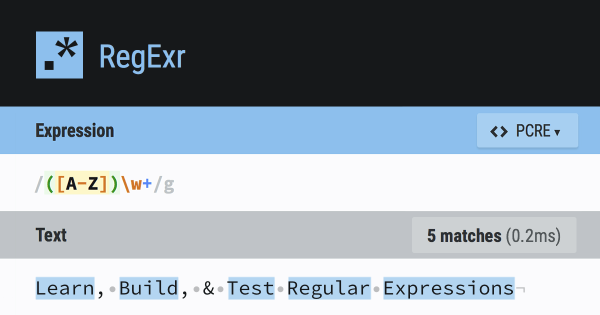
You can test these visually at the really-very-useful-indeed Regexr site or using an app such as Patterns.
So now I have a ‘clean’ set of Markdown which will also happily display images correctly when previewed in something like [Marked][#Marked]. In this case, also assuming the image assets are in the same folder as the Scrivener project. You can add relative image paths if you don’t mind typing a few more characters!
If you’re using GitHub Pages to host your content then kramdown 1.5 is still in use, with the ial block level support only appearing in 1.6. Version 1.8 with support for block-level ials for images currently has an open pull request. As soon as it’s merged you’ll get this behaviour ‘out of the box’ for standard GitHub Pages hosted sites.
Example
This is the initial, minimal, Markdown as typed in Scrivener:

This is the full Markdown present in the file created by the Scrivener compilation step:
[![A lovely fleuron][]](/assets/images/logo@3x.png)

[A lovely fleuron]: /assets/images/logo.png 'A lovely fleuron'

{: srcset="/assets/images/logo@2x.png 2x, /assets/images/logo@3x.png 3x" }
And this is its final html after the Jekyll conversion step:
<a href="/assets/images/logo@3x.png">
  <img
    srcset="/assets/images/logo@2x.png 2x, /assets/images/logo@3x.png 3x"
    src="/assets/images/logo.png"
    alt="A lovely fleuron"
    title="A lovely fleuron" />
</a>
Ironically enough, the raw html may be less verbose than the fully-specified kramdown version. If you aren’t convinced of any benefits of keeping your images in this kind of ‘more-or-less Markdown’ syntax, you could just swap out the regex to replace the short form Markdown syntax with the html directly. Any Markdown processor will honour the html when it’s being rendered:
<a href="/assets/images/$2.$3">
  <img
    srcset="/assets/images/$2@2x.$3 2x, /assets/images/$2@3x.$3 3x"
    src="/assets/images/$2.$3"
    alt="$1"
    title="$1" />
</a>
With this change in place, prior articles on the site will also now correctly render their images at the appropriate resolution for your device.
Responsive images using markdown in scrivener ·
references
http://fletcherpenney.net/multimarkdown/
http://kramdown.gettalong.org/syntax.html#block-ials
http://caniuse.com/#search=srcset
RegExr is an online tool to learn, build, & test Regular Expressions (RegEx / RegExp).
http://krillapps.com/patterns/
Changes that come with updating from 1.5.0 to 1.9.0 Changes from 1.9.0 10 changes: Updated Rakefile to fix website generation Simplified AST converter and renamed it to HashAST Implements an Abst...